
Brand identity · Real estate
Grande Realty
of SWFL
A regionally rooted identity designed to introduce a new independent brokerage with confidence, character and a clear sense of place.

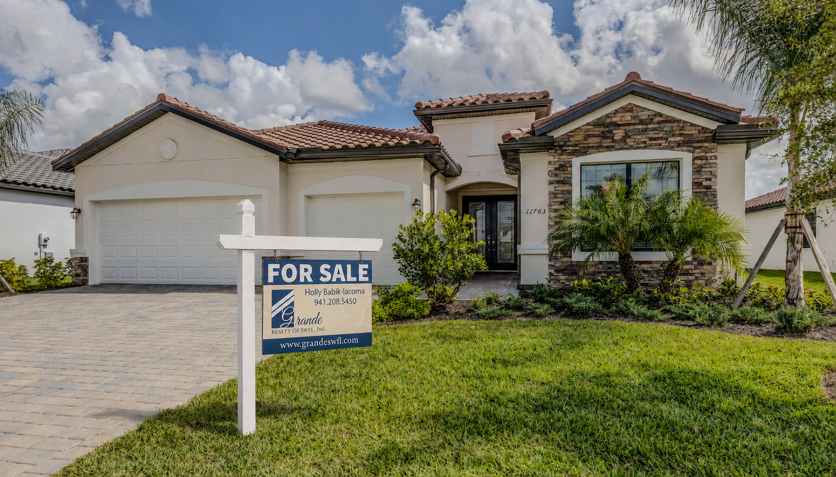
Residential signage · Brand application mockup
01 · The brief
A new business needed to feel established from day one.
When an experienced Southwest Florida broker decided to establish her own company, the assignment extended well beyond creating a logo. Grande Realty needed a complete identity capable of introducing the brokerage with confidence, supporting the practical materials required to enter the market and remaining personal enough to reflect an independently owned business.
The new identity also needed to complement the existing visual presence of the owner's husband's contracting company. The businesses were separate, but their brands needed to feel compatible when encountered within the same professional network.
Regional without becoming predictable. Refined without losing the personality of an independent brokerage.
02 · The idea
A name and visual language connected to place.
The name Grande drew inspiration from the Boca Grande area and carried a natural sense of confidence and regional familiarity. That connection shaped an identity informed by the coastal communities surrounding Rotonda, Englewood and Placida.
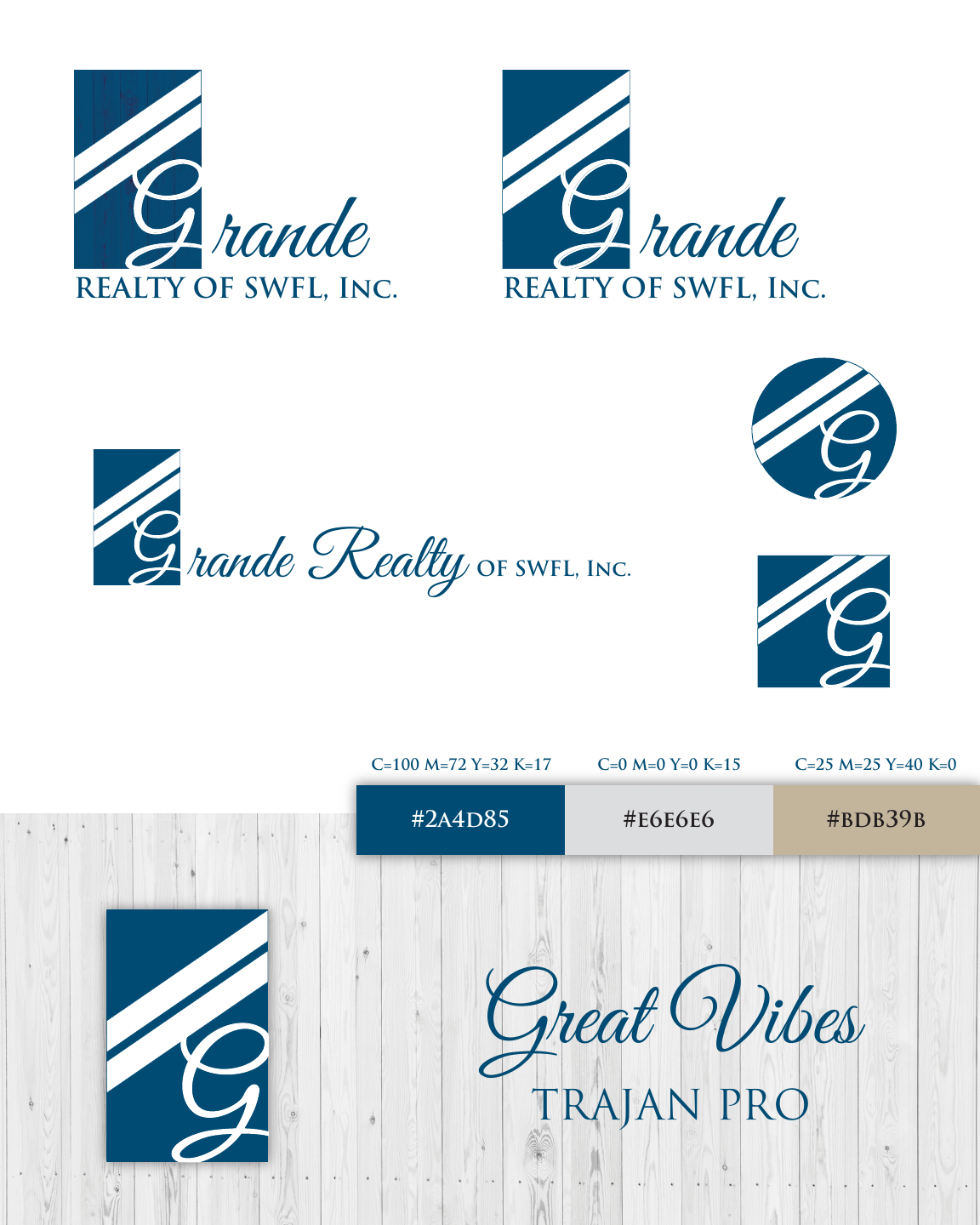
Deep blue referenced the water and established an immediate visual anchor. Warm sand-colored neutrals and weathered wood introduced a more grounded quality, creating a palette that felt distinctly Southwest Florida without relying on literal palms, waves or other expected coastal imagery.
Color & material
Coastal depth.
Weathered warmth.
A restrained system of deep blue, soft gray and warm neutral tones gave the identity enough structure for professional use while preserving a subtle connection to the landscape it served.
03 · The mark
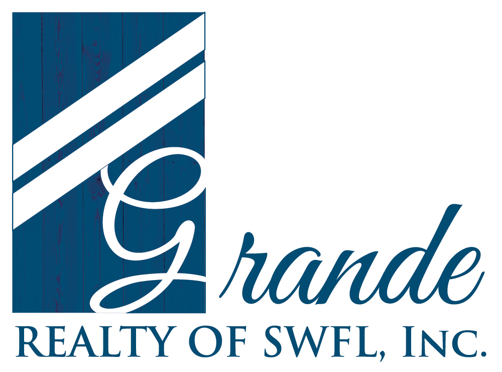
A front door, reduced to a distinctive symbol.
The vertical rectangle was designed to suggest a front door: an architectural form tied naturally to real estate and to the idea of beginning somewhere new.
The sweeping G introduced movement and personality inside the structured frame, while the diagonal lines created direction and a subtle visual relationship with the companion contracting brand. Together, the elements balanced structure with elegance without resorting to a literal house, roofline or key.
04 · In application
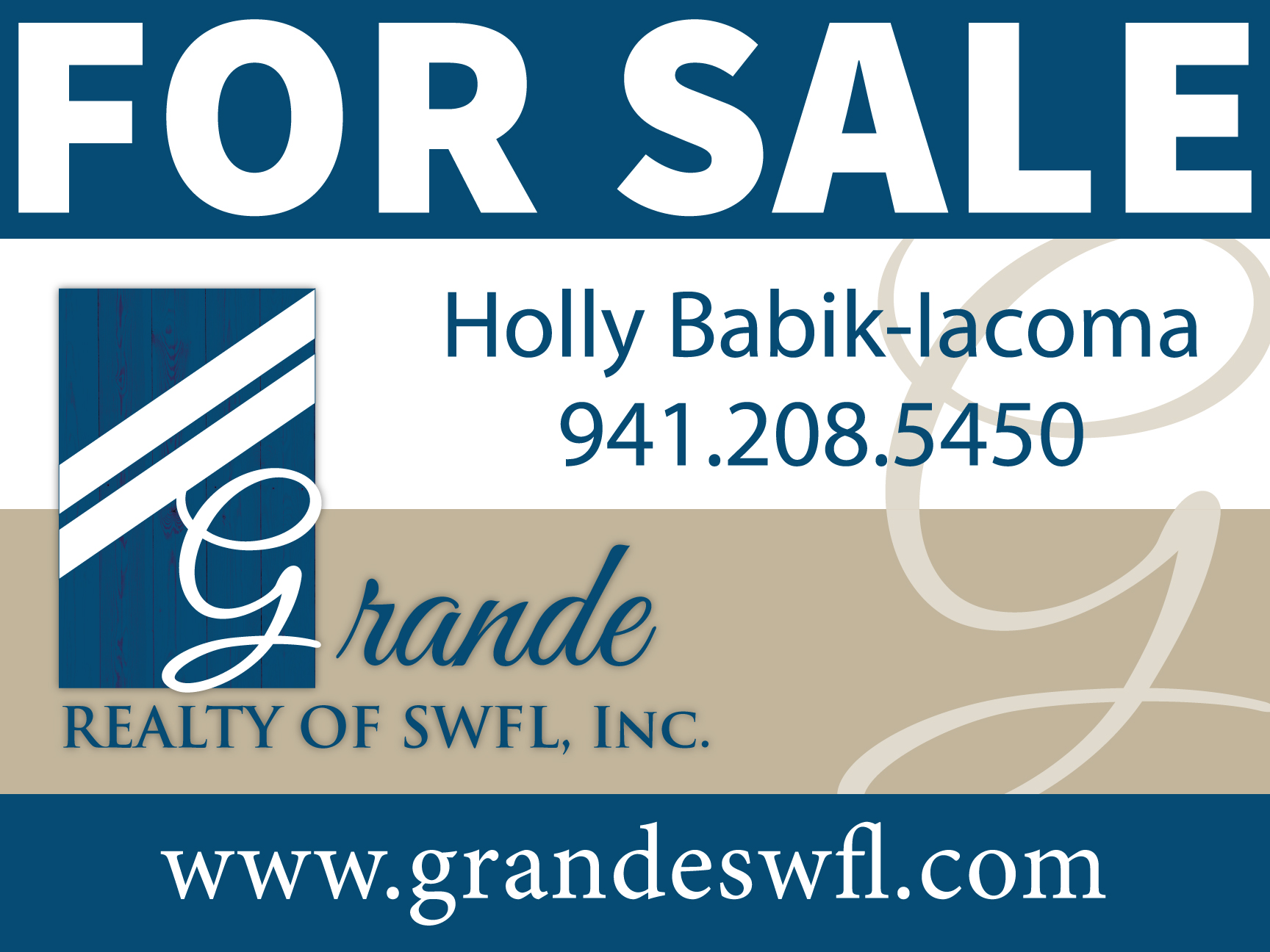
Designed to work from the business card to the front lawn.
Designed for lasting recognition.
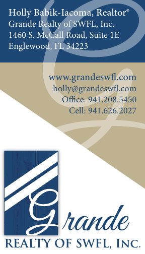
After several directions were presented, the selected identity was developed into a flexible family of marks, then adapted across business cards, residential signage and marketing materials. Each piece kept the same visual character while changing its hierarchy to suit the format and viewing distance.
Together, those applications gave Grande Realty a cohesive visual foundation for launch—one that felt established, coordinated and recognizably tied to Southwest Florida across print, signage and digital platforms.
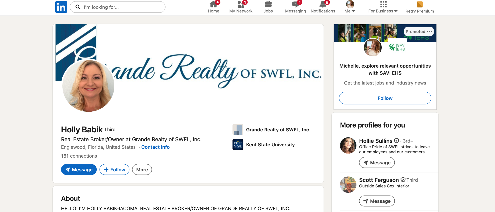
Years later, the identity remains visible on the broker-owner's professional LinkedIn presence. Its continued use is simple proof that the design became a lasting part of how she represents her company.
Built for the place it serves